Website design from UX to UI to implementation
A web design agency practice for B2B growth — website design, redesign, UX, UI, and engineering that convert demand and connect to your growth stack.
Website design that converts is the job. Magnet’s Digital Experience practice is the system behind it — UX, UI, and engineering for B2B sites that carry brand, turn demand into pipeline, and connect to search and GTM. It is the primary surface in Foundation: the place Activation traffic lands and Acceleration experiences extend.
From our Cincinnati base we design and build responsive, high-performance screens in the framework that fits the job — Next.js, Webflow, or the stack your team can operate — with performance targets set before development begins. Then we wire analytics, CRM, forms, and marketing tools so the experience is measurable and operable, not a static brochure.
Hierarchy, speed, and clarity do the selling. That is revenue web psychology in practice: service architecture buyers can navigate, proof that survives a committee, and paths from overview to depth without friction. For teams evaluating a Cincinnati B2B website redesign, the bar is conversion infrastructure — not a refreshed look that still leaks demand.
Digital Experience inherits brand architecture and a messaging system, then hands conversion paths and search a site worth ranking and measuring. Core Web Vitals are requirements, not afterthoughts.

Martin Stark
Design Lead
“The best B2B site disappears into the decision. Hierarchy, speed, and clarity do the selling — decoration just slows the buyer down.”
Digital experience is website design built for B2B growth — UX, UI, and engineering that convert demand and connect to your stack. We ship high-performance sites with Core Web Vitals as requirements, not afterthoughts.
UX Architecture defines user flows, information architecture, and wireframes. UI Design applies the brand system to layouts, components, and states. Development ships responsive, high-performance screens in the chosen framework against explicit Core Web Vitals targets.
Integration connects analytics, CRM, forms, and marketing tools. QA & Refinement tests correctness, performance, accessibility, and polish before the experience goes live and keeps iterating after.
Digital Experience is the Foundation website design surface Activation traffic lands on and Acceleration landing experiences and CRM flows extend.
What this looks like in the field.
Digital Experience as part of the FAAR system — engagements where strategy, engineering, and distribution ran as one loop, not one-off deliverables.
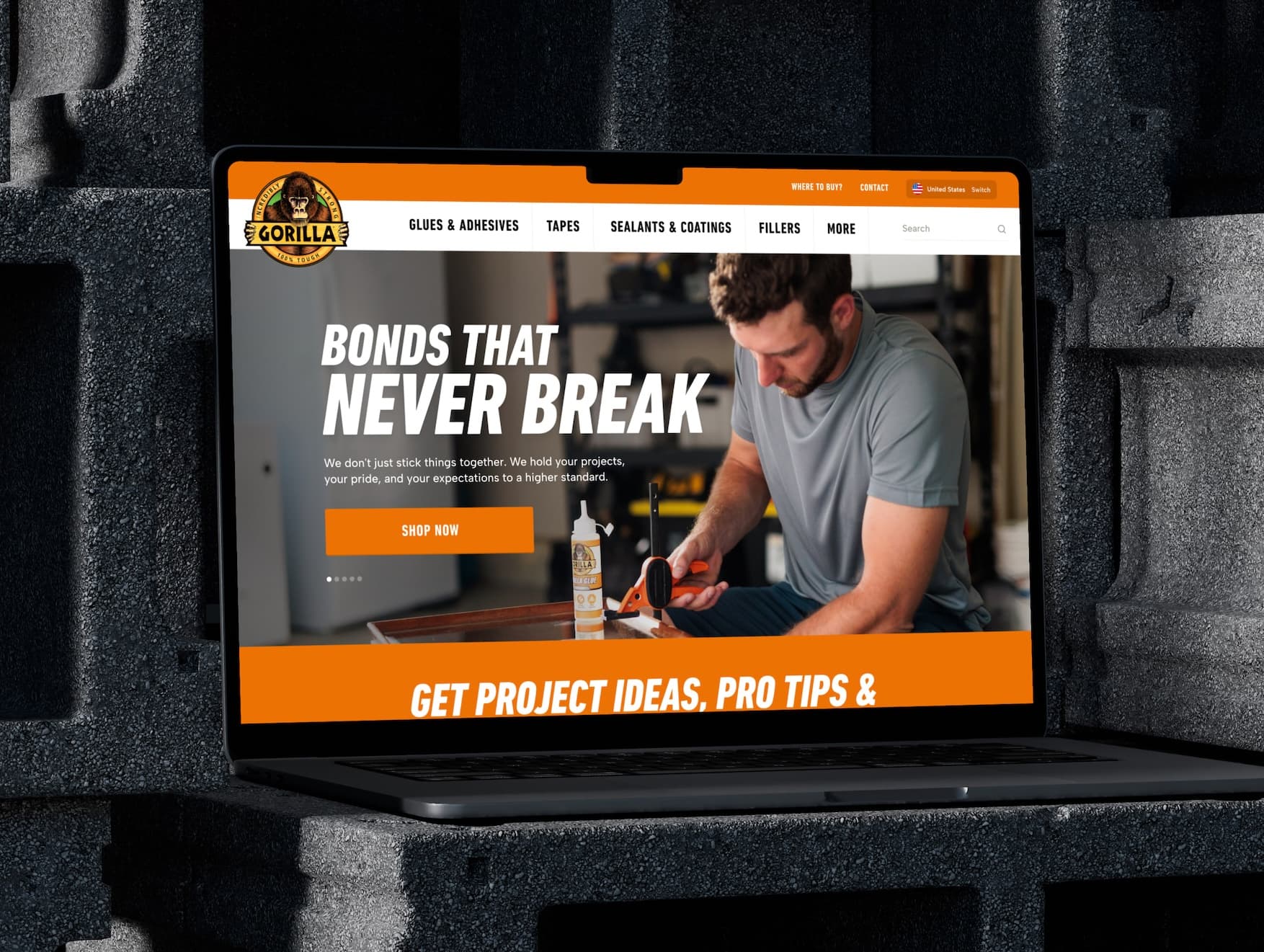
Gorilla Glue
Consumer brand ecommerce website redesign for DIY commerce
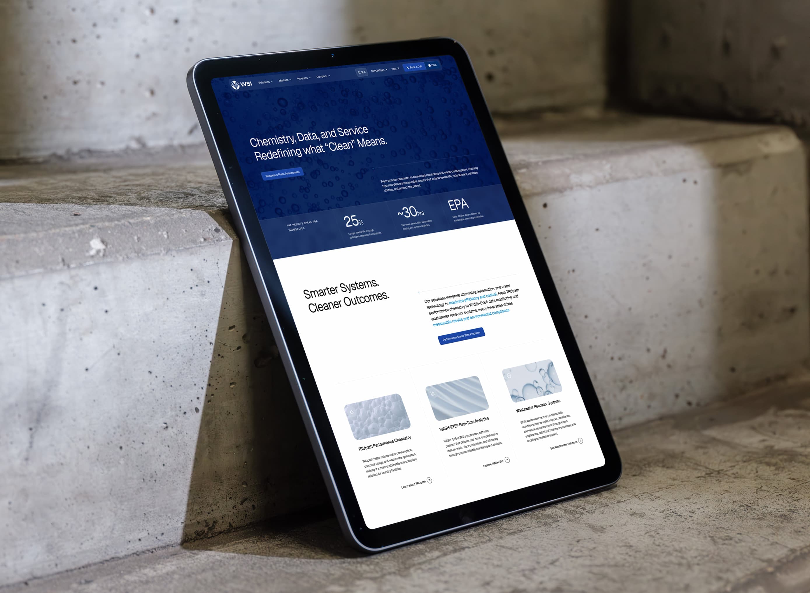
Washing Systems
Industrial B2B website redesign for laundry chemistry operators
Other solutions in Foundation
Brand Architecture
Positioning, narrative, identity, and a visual/verbal system that every channel can run on. The strategic infrastructure…
Messaging System
ICP insights, messaging hierarchy, and page- and channel-level frameworks so web, ads, email, and product speak with one…
Conversion Architecture
Conversion rate optimization built as architecture — funnel design, offer pathways, tracking, and measurement so every c…
Data & Analytics Setup
Tracking, tagging, dashboards, and baselines so growth decisions run on clean data and consistent naming from day one.
Thinking that informs this work.


Yes. Website design and web design for B2B growth is the public face of our Digital Experience practice — UX, UI, and engineering for conversion-capable sites, on a month-to-month retainer. Digital Experience is the system name; website design is the buyer language.
We ship Webflow when it fits — visual CMS, marketing velocity, and a scope that does not need a custom application stack. Many engagements use Next.js with a headless CMS instead. Platform choice follows the job and who will operate the site after launch.
Next.js with headless CMS for most custom marketing sites and application-grade experiences. Webflow when the team needs a visual CMS and the scope fits. We pick the stack your operators can run — not a site-builder default.
Yes. We pair Next.js with a headless CMS so your team can edit content without touching code. Which CMS depends on your workflow and existing stack — we recommend one during UX Architecture.
Sometimes. Integration and QA & Refinement can extend an existing build if the underlying architecture is sound. If Foundation review finds the structure is the actual constraint, we will say so before scoping any build work.
From form to a clear read on digital experience.
- 01Reply
Within one business day. A strategist responds directly — not an SDR reading a script.
- 02Intro conversation
45 minutes on site jobs, conversion leaks, and CMS constraints that slow shipping.
- 03Fit read
If there’s a match, we outline a diagnostic on IA, templates, and measurement readiness.